UK Bathroom trends for 2026 This is what modern bathrooms look like
Modern bathrooms in 2026 are all about lightness, clarity and personal moments of well-being.
The 6 latest bathroom trends are:
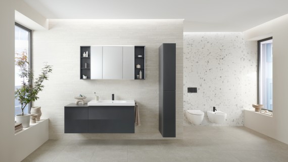
- Lofty white – Pantone’s Cloud Dancer colour creates a sense of breadth and calm.
- Wall-Hung – with its aesthetics, ease of cleaning, quieter flushing and sapce saving features.
- Order by design – clever storage solutions provide structure and harmony.
- More comfort – with shower toilets and smart bathroom lighting that appeals to all the senses.
- Walk-in showers – spacious, accessible and stylish with new solutions for floor-level showers.
- Saving water – with efficient flush technology and a perfectly coordinated WC system.

Trend 1: Lofty white in the bathroom
Cloud Dancer is the Pantone Colour of the Year 2026. Every year, the American colour institute chooses a ‘Colour of the Year’, and this time it’s a soft, white tone that exudes calm and clarity. In a world full of sensory overload, Cloud Dancer shifts the focus to lightness and creating space for mindful moments.
And this colour trend is anything but boring. Unlike cooler, pure-white shades, Cloud Dancer has soft, creamy overtones that give it a more homely, warm and elegant feel. Cloud Dancer works perfectly with natural materials like wood or stone and pairs beautifully with both pastel colours and bold, contrasting accents. Anyone who chooses this lofty white is rewarded with a timeless look that will never go out of fashion.
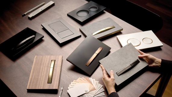
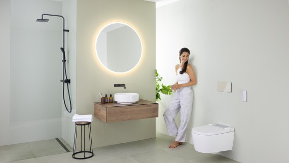
In bathrooms, the soft white tone creates a sense of space and a spa-like atmosphere. Bright areas appear spacious and calming, and they set the perfect stage for unique designs. Tasteful accessories add subtle touches while flush plates made of metal – for example nickel or brass – provide a striking, premium contrast to the white areas and give the room a modern, architectonic feel.
Because when it comes to white, not all white is the same. The same colour shade can look completely different depending on nuance and material – and bathroom lighting also plays a key role.


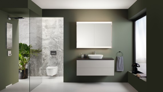
The delicate green of Renova Plan furniture perfectly complements the lofty white for a natural, harmonious and timeless feel.

Flush plates from the Sigma40 series are ideally suited for white bathrooms, either as a subtle component of the colour scheme or as a striking feature that creates a deliberate contrast, depending on the design.

Playing with light is particularly exciting in a bright bathroom. Variable lighting increases the sense of space, adds vibrancy to nuances and creates soft or clear accents depending on the mood.
TREND 2: WALL-HUNG TOILETS
Wall-hung toilets are not just a bathroom trend. They are fast becoming the 'must have' configuration in modern UK bathrooms. The reason for their popularity gain is seven-fold.
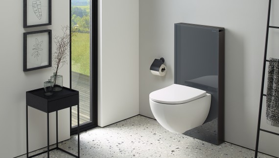
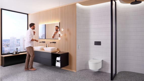
They are easier to clean, as the cistern and pipes are neatly hidden behind the wall and there is no base to trap dirt or hinder cleaning of the floor beneath. They give the perception of a more open and spacious bathroom in contrast to close-coupled toilets, by reducing the outward projection and creating more space in the room. The design is both aesthetic and practical, reducing visual clutter whilst still providing design flexibility and choice.
A much overlooked benefit is the reduced flushing noise as the mechanism and pipes are all hidden behind the wall, so the sound is also reduced, creating a quieter and more discreet bathroom experience.
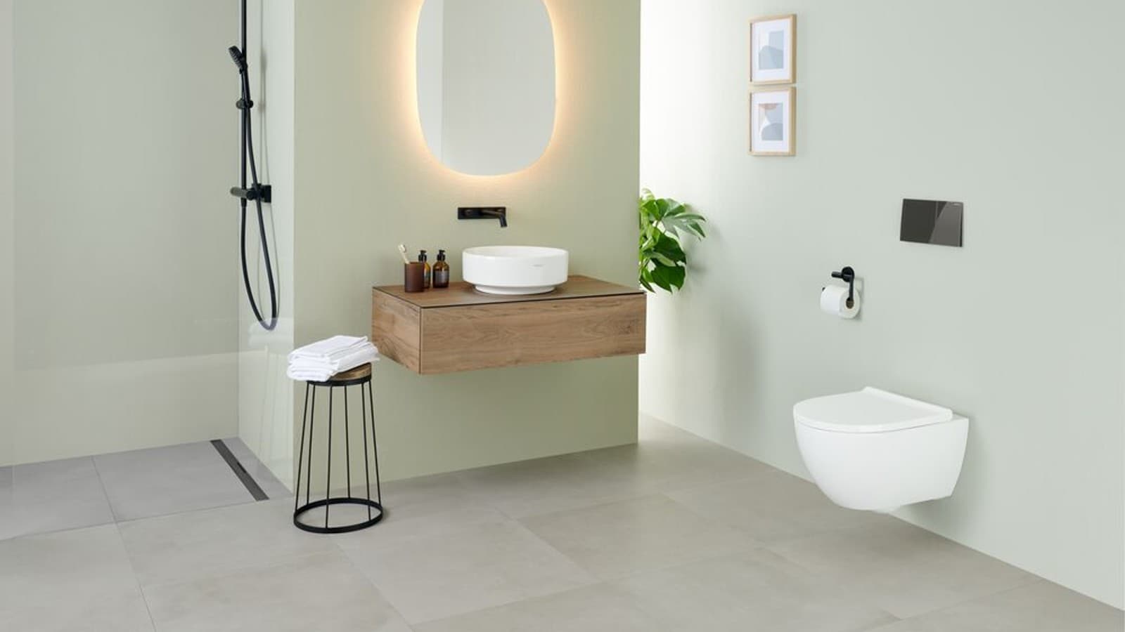

Geberit One wall-hung toilets offer a thorough flush with TurboFlush, easy-remove seats and integrated capacity for adjusting the height
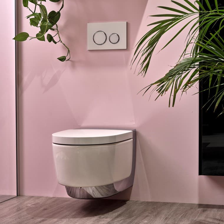
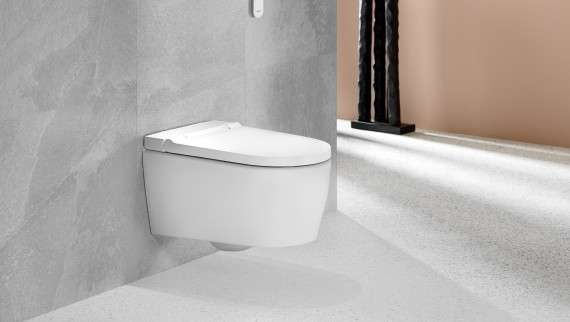
Geberit AquaClean shower toilets make cleaning with water a matter of course. At the touch of a button, they provide a uniquely fresh experience in terms of cleanliness and well-being.

The Geberit iCon wall-hung WC offers TurboFlush technology, QuickRelease function and an easy -fit installation system
Trend 3: Order by design
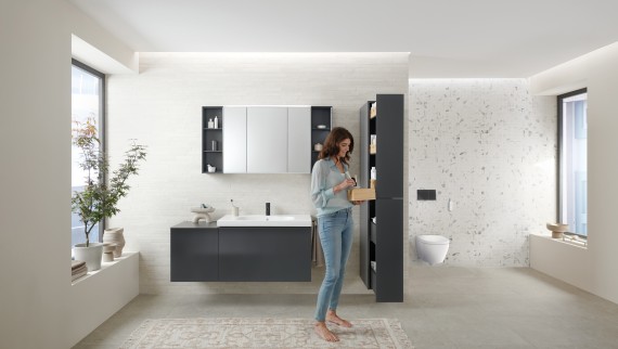
Storage space has always been an important aspect of bathroom design and has both a practical and visual impact. Nothing should spoil the harmony of perfectly colour-coordinated walls, bathroom furniture, ceramic appliances and accessories – certainly not any brightly coloured beauty or care products. So anything that doesn’t match the colour scheme is hidden away in drawers or cupboards. This is exactly what creates the peaceful, airy feel of a modern bathroom.
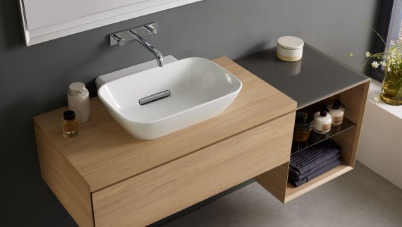
Well-designed organisation systems, with space for any bathroom essentials, are available for furniture in the Geberit ONE, Acanto and iCon bathroom series. The bamboo and lava-coloured storage compartments can be adjusted as required and optimised for the width of any drawer. With everything stowed away, surfaces remain free and uncluttered for an undisturbed look – and harmonious feel.
In small bathrooms, every centimetre counts. Smart storage solutions can turn cramped rooms into comfortable spaces. Order has long been about more than just function. It’s now a design principle that promotes clarity and well-being.


The orientation light on the Geberit AquaClean Mera Comfort shower toilet provides gentle lighting for trips to the toilet at night.

The elegant Geberit Monolith Plus sanitary module features a continuously adjustable light, making it easy to set the perfect mood. The slim flushing cistern is easy to install in front of the wall in just a few steps.

The ComfortLight lighting sets the scene for the room and provides the perfect lighting for every time of day. The light strip on the bottom of the washbasin cabinet from the Geberit ONE bathroom series makes it a real eye-catcher.
Trend 4: More comfort in the bathroom
Modern, comfortable bathrooms are places that provide a sense of calm, guarantee hygiene and adapt seamlessly to suit different needs. Geberit AquaClean shower toilets offer a whole new level of freshness and well-being.
The gentle cleaning with water provides a lasting feel of cleanliness. Personal hygiene becomes a wellness experience thanks to our patented WhirlSpray shower technology and personalised settings for spray arm position, water temperature and spray intensity – all of which are easy to adjust with a remote control or using the Geberit Home App.
We offer the perfect model for every budget. And what’s more, you can retrofit a shower toilet in almost any bathroom.
The lighting in your bathroom also has a big impact on your well-being. The Geberit ComfortLight, which is integrated into the mirror cabinet of the Geberit ONE bathroom series, helps create the perfect mood for every time of day – either as a gentle orientation light at night, relaxing candlelight for peaceful moments or bright light for beauty care.
The light sources are connected and continuously dimmable, and they automatically adjust the colour temperature to suit the brightness. Everything is intuitive to control, and you can also use the Geberit Home app.
More comfort means a bathroom that appeals to all the senses.

Trend 5: Walk-in showers
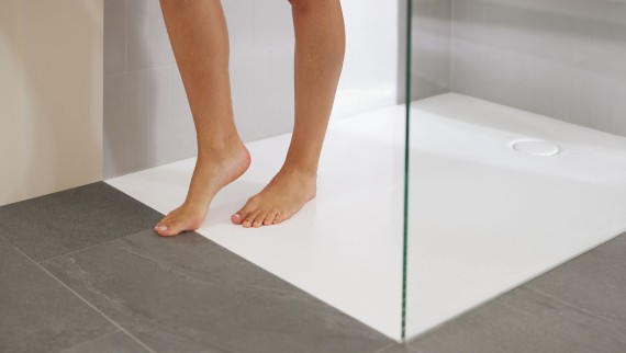
Walk-in showers are the very definition of elegance and functionality. Walk-in showers are accessible and fit into almost any bathroom. Their minimalist design offers a spacious and modern look. Unlike a shower curtain or sliding door, a glass partition gives the room an open feel and makes it seem larger.
You can choose between two elegant models when installing a walk-in shower: a floor-even shower surface or a tiled solution with an integrated shower channel.
In 2026, Geberit will launch new solutions for both options in the form of Geberit CleanFloor30 and Geberit CleanLine30, which combine aesthetics with everyday practicality and make walk-in showers the centrepiece of any modern bathroom.


The WhirlSpray shower technology delivers optimal cleaning and a particularly pleasant sensation combined with low water consumption. This is achieved by means of a pulsating shower spray. Choose between five adjustable shower pressure settings.

The TurboFlush technology ensures that flushing out the toilet is particularly thorough and quiet. Any hidden areas are reduced to a minimum and there are no corners or edges. The rimless ceramic is very easy to clean.

The shower toilet can be controlled at the touch of a button. Not only does the intuitive remote control indicate the device status, but it can even set the shower spray to the perfect temperature.
Trend 6: Saving water in the bathroom
Water is life, and you can save much more in the bathroom than many people think. Turning off the tap while brushing your teeth or shampooing your hair and using a smaller amount of water when you flush the toilet are great first steps, but flush technology can make the biggest difference. In a typical Western household, flushing the toilet accounts for around a third of the water we use everyday.
Efficient flush technology
The way water flows around the WC ceramic has a major impact on flush performance. Systems like Geberit TurboFlush technology guide the water around the ceramic in a spiral motion, which provides a thorough clean and means that a single flush is enough to completely flush out the system. All Geberit WCs with TurboFlush are also rimless, so they are easier to clean.

The Geberit WC system
When all components – fill and flush valves in the cistern, flush technology and ceramic appliances – are designed to work together perfectly, it brings even more efficiency. The Geberit WC system outperforms European toilet flush standards by up to 10 times, without compromising hygiene or comfort. And what’s more, the perfectly coordinated WC system doesn’t just save water – it also produces an extremely quiet flush.

Design your dream washbasin area in just a few clicks
Find a showroom Browse and buy products
Newsletter Register now
Stay up to date
Our newsletter provides fascinating insights and handy tips on how your bathroom can make your life easier.
Plan your dream bathroom in just 3 steps We offer inspiration, help with planning and show you where to find your nearest showroom

1. Get inspired
Answer a few questions and we will offer you some ideas for your dream bathroom. Our inspiration tool will help you narrow down what you’re looking for. Try it out now for free!

2. Plan your new bathroom
Choose your favourites from an extensive selection of products. Design your own personal oasis of well-being today with the 3D bathroom planner.

3. Find a showroom
Take a look at our products in a showroom setting. Visit a specialist partner near you for expert advice.
